
Typography Matters: Choosing the Right Fonts for Your Brand
Typography is often overlooked, but it plays a critical role in how a brand communicates visually. The right typography enhances readability, sets the tone, and helps convey your brand’s personality.
The Influence of Typography on Brand Perception
Typography influences how customers perceive your brand before they even read a word. A luxury brand might use elegant serif fonts, while a youthful startup might opt for playful sans-serif typefaces.
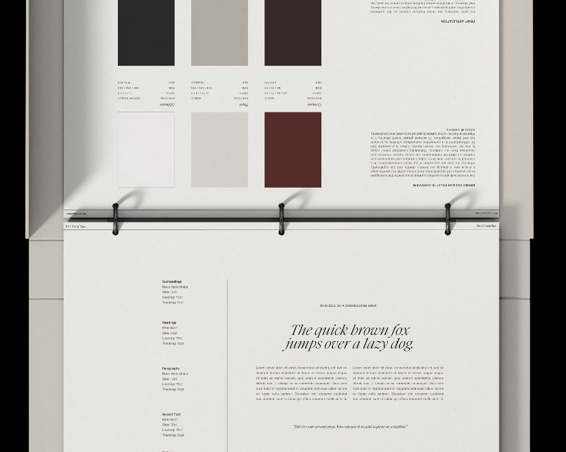
Understanding Font Categories
Serif Fonts: Traditional, elegant, and trustworthy. Ideal for high-end brands or professional services.
Sans-Serif Fonts: Clean, modern, and accessible. Perfect for tech companies and minimalist brands.
Script Fonts: Creative, personal, and artistic. Best used sparingly for logos or headers.
Display Fonts: Bold and eye-catching. Use for headlines or callouts to grab attention.
How to Choose the Right Font Pairings
- Start with a Primary Font: This will be the font used for headers and key visuals.
- Add a Complementary Font: Choose something more neutral for body text to ensure readability.
- Limit Your Choices: Two to three fonts are ideal to maintain consistency.
- Test Across Devices: Make sure your font choices are legible on both desktop and mobile.
Typography Best Practices
- Maintain adequate spacing and line height.
- Avoid using too many different font weights.
- Prioritize accessibility by ensuring good contrast.
Choosing typography that aligns with your brand personality can elevate your entire visual identity.